10 Welcome Email Template Examples That Grow Sales From Day 1
Carl Sednaoui
The welcome email is the most important email brands can send to new subscribers.
Yes, even more important than all the broadcast, targeted and triggered messages combined.
The welcome email is your best shot at converting new subscribers into customers — and longtime readers.
A well-designed welcome email hits these three notes:
Provide subscribers with the value proposition you promised during the signup process (e.g. a 15% discount).
Prompt subscribers to take the next steps in their journey, whether that’s creating an account, completing a download, starting a purchase or whatever your strategic goals are.
Build engagement right away. Why wait to get the party started?
But not just any welcome email will do.
At this point, you might be thinking, “You don’t need to sell me on welcome emails. My ESP sends them out automatically as soon as subscribers confirm their email addresses. I’m covered, right?”
Probably not.
It’s true that a default welcome email is better than none. (We’re looking at you, MailChimp users.) But you can expect better results from a welcome email that is strategically designed with the look and voice of your brand, with content that tackles the three points listed above.
After all, that’s true email marketing.
Speaking of MailChimp, in the Email Gallery below you will see how two BigCommerce customers improved on MailChimp’s serviceable but ho-hum welcome email format. Let’s dive in!
More than half of brands are missing out
Statistics on how many brands send welcome letters vary. Most hover a few points above or below 50%:
A 2015 Salesforce benchmark study found 42% of brands send welcome emails. Among those that do, 72% rate them as highly effective.
Econsultancy’s 2017 survey of UK and U.S. marketers found 44% sent welcome emails – surprisingly, down 2% points from 46% in 2016.
Among Internet Retailer’s top 100 ecommerce websites, 87% send welcome emails, and 49% percent of those brands send more than one.
It’s also worth noting that 3 out of 4 email subscribers expect to see a welcome email after subscribing.
Be there for them!
Welcome emails are a big deal
These stats (all averages) are from BigCommerce partner Soundest, showing what welcome emails can deliver:
45.7% open rate (compared to 18.8% on promo emails)
9.7% click rate (compared to 3.8% on promo emails)
1% conversion rate (compared to 0.17% on promo emails)
61 cents revenue per email (compared to 10 cents on promo emails). Revenue per email can go up to $3.36 on optimized emails.
Given the stats we’ve seen so far, I hope we can all agree that sending a welcome email is a no-brainer. In the next section you’ll find some tips and tricks to help you design a great welcome email and start making money for your brand via more loyal customers.
6 easy ways to optimize your welcome email
Follow these tips to add value to your emails and prompt subscribers to start engaging with you.
1. Send your welcome email ASAP
Real-time welcome emails drive up to 10X better results than messages batched and sent one day or even a few hours later.
Start communicating with your subscribers while you’re still top-of-mind.
Here’s an example.
You land on their site
They push you to sign up via an email to get an immediate discount (that you are encouraged to use in 60 minutes or less –– GENIUS)
Then you get an immediate welcome email (with an additional ad on the side).
2. Include branded imagery
No disrespect to our IT colleagues, but they aren’t marketers. Default emails just state the obvious:
“Your subscription is confirmed.”
“You successfully created an account.”
By the way: Those are confirmation emails, not welcome emails. If that’s what you send to new subscribers, you’re not sending welcome emails.
People connect with other people, so your message should sound like one human being speaking to another. That’s what moves subscribers to engage with your brand (and, ultimately, convert).
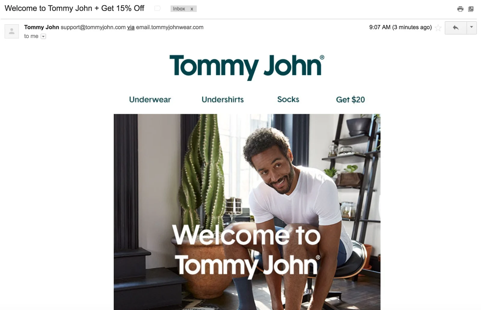
Make sure your welcome email template plays nicely with your other email templates. And don’t forget to include imagery that is aligned with your website –– this helps reinforce your brand.
Here’s a great example from Tommy John. Note –– this is a WELCOME email. Not a subscription confirmed email.
3. Ask the subscriber to do something
It doesn’t have to be a big ask. In fact, it shouldn’t be. You don’t want to scare anybody off by asking them to fill out a preference form with more questions than a job application.
Invite subscribers to take the next step with you.
That might mean checking out your products or completing a low-hurdle request, such as answering a one-to-two-question survey (that will give you data you can use for segmentation and targeting).
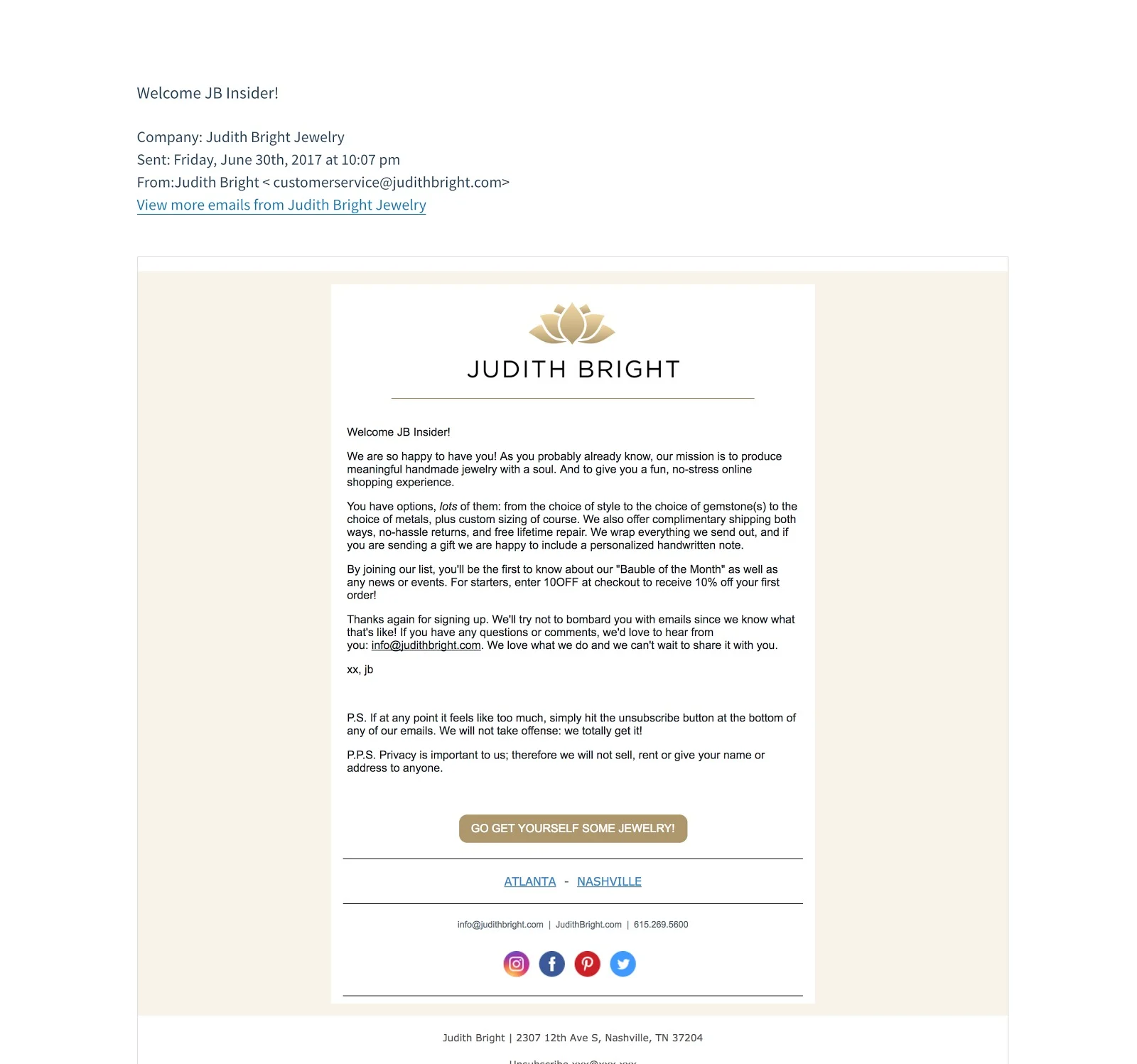
The CTA should be totally on brand. We love jeweler Judith Bright’s call to action, in a gold-colored button: “Go Get Yourself Some Jewelry!” Irresistible.
4. Track email behavior right away to ward off inactivity
Here’s how you keep subscribers from morphing into Zombies: Don’t wait months or years before putting them into a reactivation program.
Subscriber interest can wane within days or weeks.
Segment your new subscribers, and see who’s opening and clicking and who isn’t.
Resend the welcome email to anyone that didn’t open or click your first few emails –– or send a follow-up message asking if they’re having problems with the email or site.
5. Rename your welcome email to reflect the outcome you want
Secretly, you want your welcome email to do more than welcome subscribers. It should prompt them to take actions that will increase their value to you, such as buying for the first time or creating an account.
This means your welcome email could become a “first-purchase” email, or an “upgrade” email.
It doesn’t lessen the value of saying “Welcome to our fabulous email program.” But it forces you to think strategically about what you want this email to accomplish, and that will guide the email’s design and content.
Here are a few headline examples from the brands we’ve already covered above:


See a trend? This leads us to….
6. Deliver opt-in incentives and rewards in the welcome email
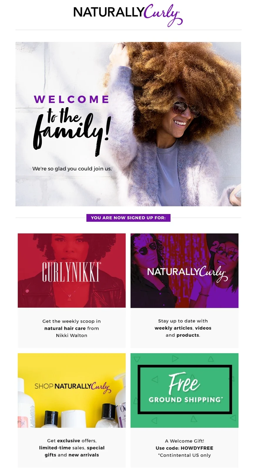
If you offer a discount, freebie or other incentive in exchange for the email address, deliver it in the welcome email.
Sorry for being cynical, but it’s too easy for someone to give you a fake or throwaway email address, grab the incentive from a thank-you page on your site, and split.
Use that page for your IT-approved success notice instead where you notify subscribers to look in their inbox for your special welcome email which will have important information and their goodies.
Here’s how NaturallyCurly.com does it:
5 Sample Welcome Letter Templates from the MailCharts Gallery
The MailCharts email database is full of great welcome letters from BigCommerce clients. You’ll find some of my favorite emails below, along with other hand-picked examples.
Note: You can click on any image to view the full-sized email.
1. Josie Maran Cosmetics
Subject line: Welcome to Josie Maran Cosmetics!
Why it works
This welcome email hits all the highlights. The subject line greets the new subscriber, and the preheader (“Take 10% Off Your Next Purchase”) reinforces the incentive and CTA inside the email.
The copy states the company’s values and competitive differences, and it has an arresting image. Plus, it sends the subscriber back to the site with the 10% discount and clear CTA button.

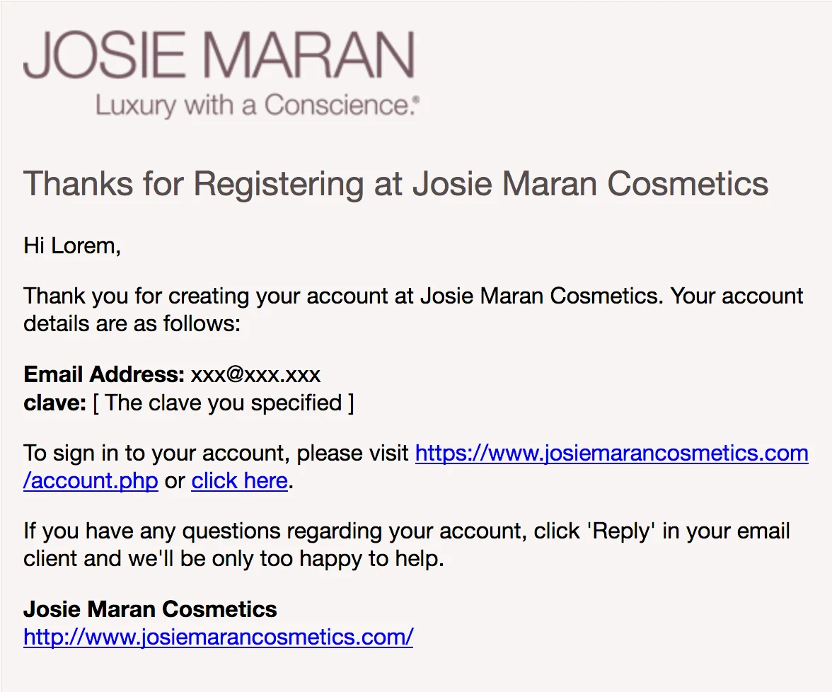
Want to see the difference between a welcome email and a confirmation email? Here’s the first message Josie Maran Cosmetics sent (this is a confirmation email):
Subject line: Thanks for Registering at Josie Maran Cosmetics
2. Kelty
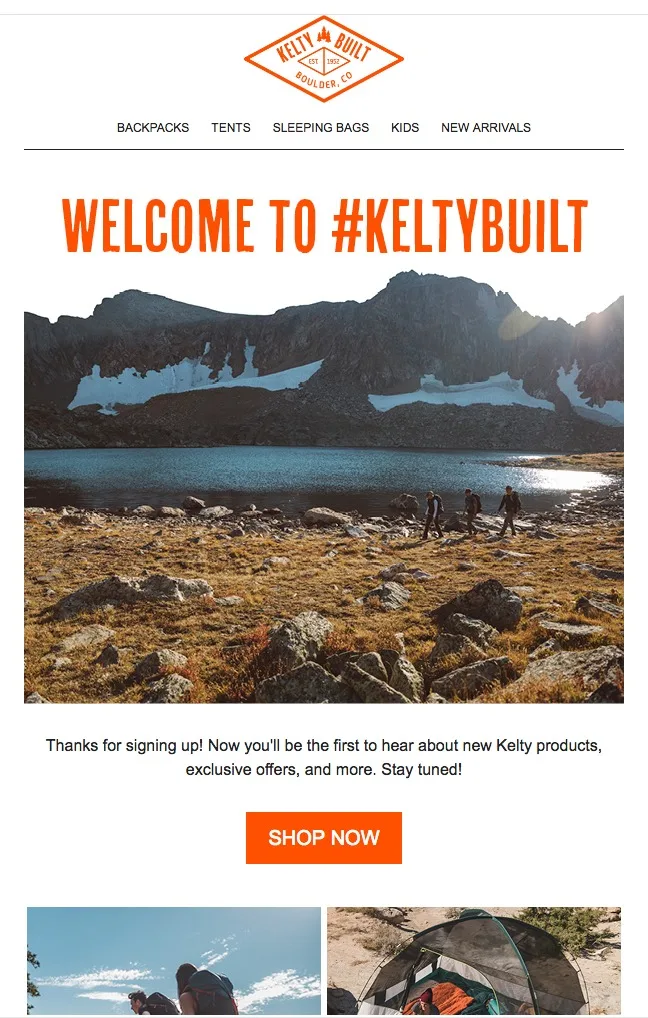
Subject line: Welcome to Kelty
Why it works
The images feature people using the products in ways that subscribers understand and may even aspire to. Maybe you can’t climb Kilimanjaro, but you can hike up a hill and hang out with your buddies in comfort.
We also like how the email links to the blog at the end, for people who aren’t ready to shop.
3. Iglu Ski
Subject line: Welcome to Iglu Ski
Why it works
Here’s an action-oriented welcome message!
It spends a little time greeting newbies and then gets right down to business, combining great images with links to the key locations on the website. We also like including email and phone contacts, too.

4. Four in the Bed
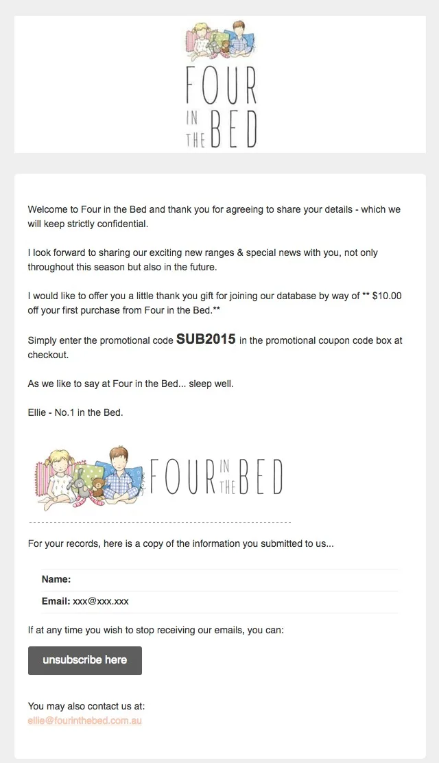
Subject line: Four in the Bed Online Customers: Subscription Confirmed
Why it works
We like how Four in the Bed customized the standard MailChimp welcome email format with their own logo, copy that reflects the brand voice and value and incentive delivery.
Note: One issue we have with MailChimp’s template is how prominent the unsubscribe button is. If you use MailChimp, put your call to action in a button that’s more prominent than the unsubscribe button.
5. Musto
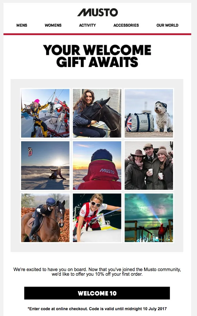
Subject line: Your Welcome Gift Awaits
Why it works
This is a triple-duty welcome email.
The socko subject line kicks it off (not just “Welcome to …”). The gift code is easy to remember, which reduces shopping friction. The email aims to build community, not just mentioning “community” in the copy but also showing most faces in the images looking directly at the recipient. That’s welcoming!
Over to you
After you tune up your welcome email using the tips and examples I shared here, keep the momentum going. Think about taking your welcome email program up one more notch. Expand it to a full onboarding series –– a triggered series of emails, each with a unique purpose.
If you’d like to learn more about MailCharts –– and how we take the hassle out of email marketing planning and research –– visit our website or drop us a note. We’ll be happy to answer your questions or walk you through a demo of our app.
Need more email inspiration? Visit the MailCharts blog to find more great email examples and ideas.

Carl Sednaoui is the Director of Marketing at MailCharts, the tool e-commerce marketers use to plan their email campaigns and track their competitors.