How to Use Digital Wallets and Mobile Site Optimization Tactics to Stamp Out Cart Abandonment
Graeme Keeton

If your site isn’t responsive and optimized for mobile, chances are around 75% of people will bounce without making a purchase.
Want people to create an account before buying? Say goodbye to 35% of mobile customers — and that’s not even the biggest reason they leave.
The world of mobile ecommerce can be a confusing minefield for merchants, but it doesn’t have to be.
Like sleeping on an airplane, shopping on an iPhone or other mobile device still doesn’t feel quite right most of the time. That’s because most ecommerce merchants still have a few (sometimes more than a few) issues that need ironing out.
These issues, it turns out, aren’t a minor inconvenience, either — they’re costing business owners somewhere in the region of half their potential mobile sales, and often more.
That’s ludicrous, especially when you consider that the tools and mobile ecommerce best practices exist to make shopping on mobile — whatever the scope of the purchase — quick and painless.
In this article, we’ll be taking some of the lessons we’ve learned over the years to address and discuss three main points:
What’s eating your customers when it comes to your mobile checkout experience
How and why you should be encouraging the use of digital wallets to optimize for mobile conversion
Why cart abandonment is an issue no merchant should have to face
Why are your mobile conversion rates so low?
When was the last time you visited your own website on a phone and tried to buy something? If you can find even the tiniest hiccup, chances are your customers found it, too, and they might not be so forgiving.
Eventually, we’re talking about cart abandonment, which is where a customer fills their online shopping cart with items they’re planning to buy, only to leave the site without completing the purchase. We’ll get to why that is later, but the reason we say ‘eventually’, is that there could be other reasons why your mobile site isn’t quite sitting right with potential customers, even before they’ve had a chance to shop.
Let’s take a look at a few of those reasons — and the mobile optimization tactics you can use to combat them.
Your website is unresponsive (or just looks plain bad)
As far back as 2004, studies like this one, led by psychologist Elizabeth Sillence, were telling us that how your website looks has a huge impact on how trustworthy potential customers deem your business to be.
The study — which focused on health websites — found that an outrageous 94% of respondents who were wary of a website, were wary because of the design.
A poorly-designed, unresponsive website makes you look like you don’t know what you’re doing — or worse, like you’re running a scam!
Fortunately for ecommerce businesses, picking a BigCommerce template to work with makes this one an easy fix.
And people do want to shop online from their phones, they really do.
The desire exists, and it’s through no fault of their own that consumers are running up against the same problems time and again.
There are more than a few sites, however, which prove that a responsive website is one of the surest ways of generating more revenue.
Etsy — Annual revenue: $195 million (2014)

Users love the Etsy platform so much, that over 30% of their sales come from mobile customers.
Martha Stewart Cafe — Annual revenue: $160 million (2014)

The addition of ratings under each product enhances the user experience, increasing trustworthiness.
Pop-ups and autoplay videos
When done correctly, pop-ups — or overlays, as they’re also called — can be an effective tool for adding value to the user experience and for gathering leads.
On mobile, however, overlays need to be used with some caution. Trying to click out of an overlay you’re not interested in on a phone is almost always an exercise in frustration which runs the risk of your prospect bouncing.
Try setting your overlays to appear on desktop devices only, so that your mobile customers aren’t hampered by trying to hunt for that cross (assuming they’re not interested right then, of course).
As for autoplay videos, rarely are they, or have they ever been, a good idea on websites. What works on Facebook isn’t necessarily going to fly on your site, and if you’ve got that video set to play sound too, then you can kiss those conversions goodbye.
Poor quality images and content
Part of the fun of shopping online is that we get to fantasize about the things we’re buying until they arrive, and part of that experience involves high-quality images and descriptive text which makes us feel like we’ve made a solid choice.
Not giving your visitors that feeling means they’re more likely to try and find your product (or more likely its equivalent) somewhere else.
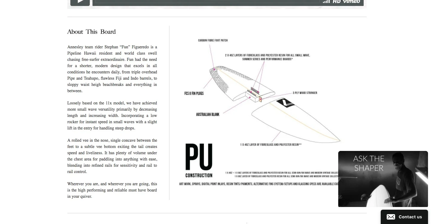
What makes a great product description? Take a look at anything Annesley Boards does.
Your site takes too long to load
We’ve all abandoned a site simply because it took too long to load, but how long do you think most people will give a site before deciding that it’s not worth their time?
10 seconds?
15 seconds?
Try 3 seconds.
According to research by KissMetrics, 40% of mobile visitors will abandon a site that takes longer than three seconds to load. Sheesh!
There’s no call-to-action (CTA)
Even though you want your customers to be in control of the experience they have on your site — how they navigate, what they choose to look at, etc. — don’t forget that it’s still your site, and you’re responsible for orchestrating what goes on there.
Without a clear CTA, visitors will either flounder around not knowing where to click or how to shop, or they’ll bounce. It’s that simple.
Every single page on your website needs to have some sort of CTA, whether that’s a checkout button, an email sign-up box or even just a ‘Like’ button.

The only CTA worth a thing is the one which tells you exactly what you’re going to get.
For a more in-depth look at what makes a great CTA, check out this post by Michael Aagaard at Unbounce.
Encouraging the Use of Digital Wallets
Digital wallets, mobile wallets, whatever you decide to call them, enabling and encouraging the use of them on your ecommerce website just makes sense.
But before we dive into this best practice for mobile ecommerce, what is a digital wallet?

Essentially, a digital wallet holds your preferred card details behind several lines of encryption, allowing you to quickly and safely pay for things on mobile without having to enter your details over and over.
Think of it like Amazon’s one-click purchase feature, made available on your other favorite sites, or like the contactless card payments you’re used to in-store.
Digital wallets are all about removing friction from the mobile buying process. Remove the barriers put up by having to enter long strings of numbers, and by tedious button clicking, and watch customers stroll right through the checkout.
Start Seeing 5% Conversion Rates on Mobile Now
BigCommerce users can integrate Amazon Pay, Apple Pay and PayPal into their sites without the need for any coding. What it comes down to is that customers want a faster way to send money, and you want a faster way to receive money. Digital wallets are that way.
What does enabling the use of digital wallets mean to revenue?
How about a 3X in mobile cart conversion for those sites which encourage payments through digital wallets?
That’s more than a pretty decent ROI for something which should be standard practice anyway, don’t you think?
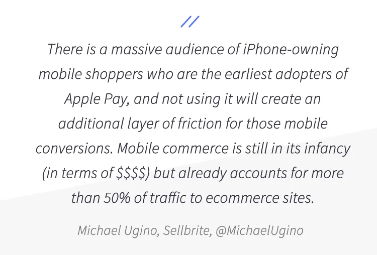
And we’re not the only ones who think so, either. These testimonials come from people talking about the difference Apple Pay makes to ecommerce businesses (you can check out the full article here).
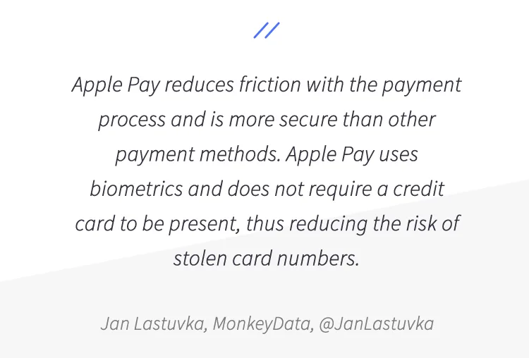
That last one, in which Jan makes a point about how secure digital wallets are, is an important thing to consider.
A report by the Baymard Institute states that almost 20% of customers abandon their carts because of concerns over the safety of their information on mobile.
It’s understandable; over the years, we’ve been conditioned to believe that entering your card details on a phone is significantly more risky than on a desktop device. Allowing users to pay using Apple Pay, Amazon Pay or Google Wallet removes that fear, which translates into more revenue for your business.
It’s these friction points that digital wallets are intended to overcome. If a customer has to remove a credit card from their wallet to type in the number every time they want to shop, there’s a higher possibility that during that time, they’ll decide to abandon their cart.
With just a couple of taps, a digital wallet can help close the sale and provide a better experience for your customer.
Let’s take a quick look at what a digital wallet versus mobile checkout experience looks like.
Here is NatoMount’s mobile experience. It takes you 3 steps to get to the digital wallet, which requires a click of a button to finalize the payment (1 additional step if you need to sign in to your Amazon account). With this set up, NatoMounts has increased mobile conversion to 5% of all mobile traffic, getting many customers to buy in less than 60 seconds.
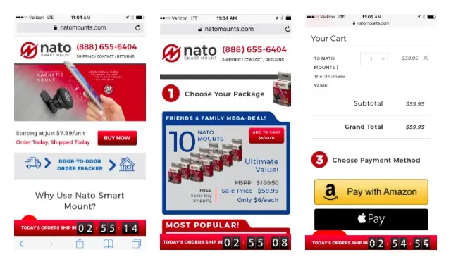
NatoMounts still includes old-school mobile checkout (which is much improved than in the past! This one is a one-page checkout…but still requires the typing in of sensitive information on small devices). Lots of sensitive info on small devices often = cart abandonment –– which we’ll address more in the next section.

Put an End to Cart Abandonment
All of this — the responsive website, quality images and content, a clear CTA and the use of digital wallets — comes together to combat that most dreaded of ecommerce problems: cart abandonment.
Cart abandonment is by far the biggest challenge facing online store owners, outside of actually getting people onto the site in the first place, on both mobile and desktop.
Everything we’ve just talked about contributes to cart abandonment (or the prevention thereof) in some way, but there are a few other things which — according to that Baymard Institute report we’ve already mentioned — could be driving potential customers away after they’ve dropped products into their baskets.
Here are some stats (read the full article here):
61%: Extra costs (shipping, taxes, fees) were too high
35%: Didn’t want to create an account
27%: The checkout process was too long or complicated
24%: Couldn’t see or calculate total order cost up-front
22%: Reported the website had errors or crashed.
18% Didn’t trust the site with their credit card information
16%: Delivery timeline was much too slow
10%: Didn’t believe the returns policy to be fair or satisfactory
8%: Didn’t see their preferred method of payment
5%: Their credit card was declined
From that list of 10, we’ve bolded half, all of which are related to payment, all of which could be solved by enabling the use of digital wallet payments.
We’ve said it before: people want to shop on their phones. That’s evident by the amount of attention abandoned cart articles are getting from marketers, SEO professionals and designers.
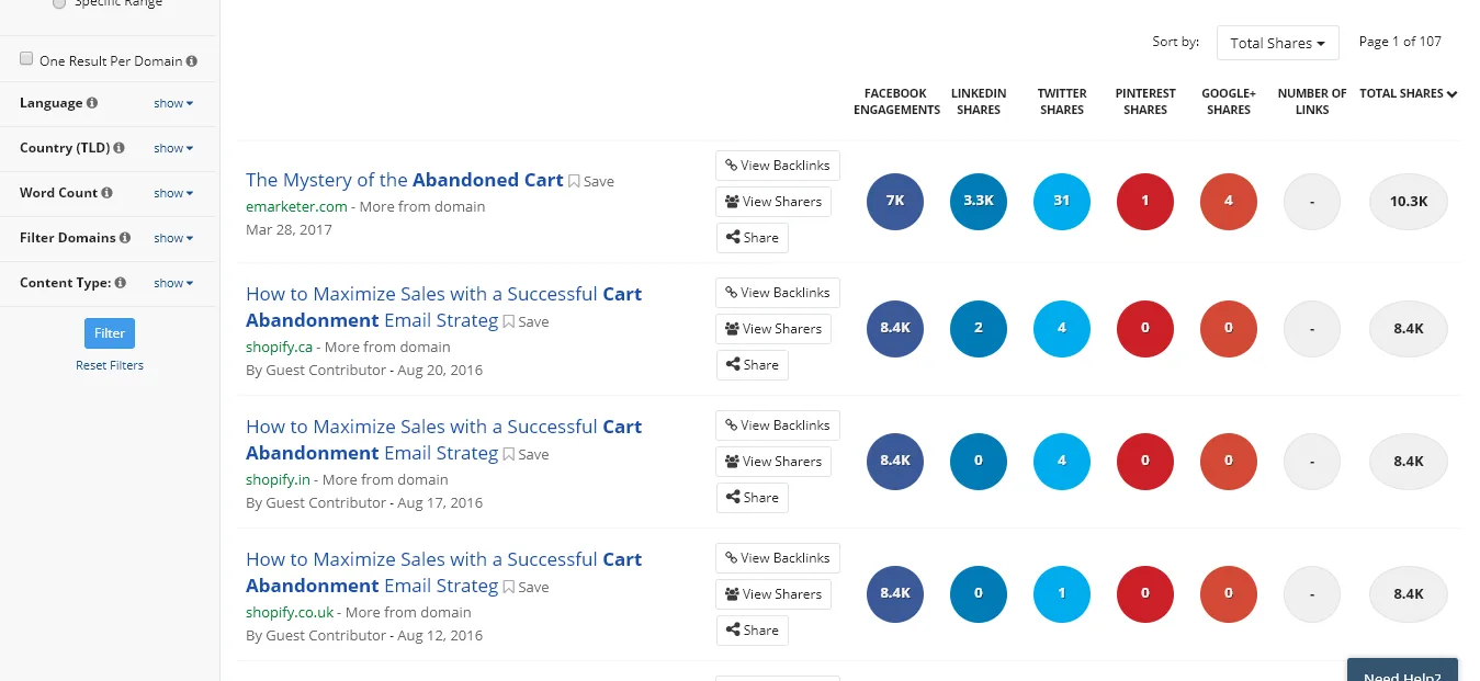
Customers and ecommerce store owners can have a beautiful, frictionless relationship, if only we (the business owners) got our acts together and started making the sites people want to use.
Everything we need is within our reach, from the right responsive templates, to information on how to write a winning CTA, to the capability of allowing customers to shop using their digital wallets.
There is no reason for cart abandonment to exist as an issue in this age of responsive ecommerce stores and digital wallets.
Putting Everything Together to Reduce Cart Abandonment
Let’s round off with a quick recap of everything we’ve learned about how to use mobile wallets and site optimization to stamp out cart abandonment and improve mobile conversion rates:
Make your website responsive — 94% of visitors leave a site whose design doesn’t inspire confidence, and a third will bounce if the website takes longer than three seconds to load.
Get rid of pop-ups on mobile — Same goes for autoplay videos (especially ones with sound). Overlays on mobile usually do more harm than good.
Ensure high-quality images and content — Recreate the experience of browsing in-store and window shopping by making the most of your imagery and copywriting.
Have a clear CTA — When guests arrive at your house, you invite them to make themselves at home, but you still show them where the bathroom and extra glasses are.
Digital wallets reduce friction — Half of the reasons people abandon their carts are related to payment. Digital wallets reduce friction and increase conversion x3.
Design with the customer in mind — If that means regularly visiting your own site to test it out, then that’s what you should do.
Did you find this article helpful? What issues have you run into as an ecommerce business owner? Let us know in the comments.

Graeme is a copywriter who works with experts in online marketing and ecommerce to create content that helps businesses increase customer satisfaction and revenue. His work also appears in Entrepreneur, Unbounce, VentureBeat and Success Magazine.